Design Plans for My Kitchen Refresh – One Room Challenge Week 2
This post contains affiliate links. If you make a purchase through one of my links, I may receive a small commission at no cost to you. Full disclosure.
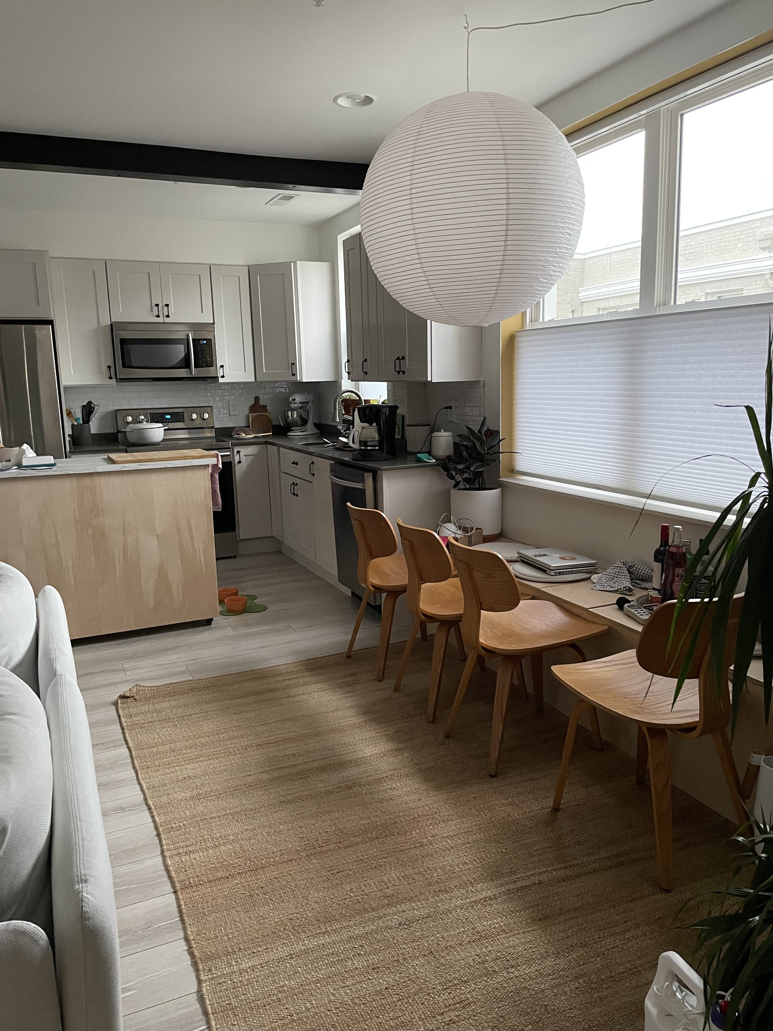
Last week, I revealed which room I'm transforming during the One Room Challenge over the course of eight weeks. Catch up on that post before you read this one. My "room" is more of a multi-room situation – our kitchen/dining/entryway space, which are all pretty much in the same big room together.
This week, let's talk design plans. Some of my fellow Featured Designers have been working ahead on their projects for a while, but so far I've only really focused on the actual design plan. Guess you could say I like to work under pressure. 😅 I made all of the mockups that you see in this post via a design platform called Spoak, which I love because it's made for design lovers who aren't (yet!) trained interior designers.
Without further ado... my inspiration board!

When I initially started making this board (back in February or March, I think), the gravity of Covid shipping and product availability delays hadn't quite sunk in. I started contacting vendors, and reality hit. Some of the pieces I wanted to incorporate either wouldn't be available in time or would arrive too close for comfort ahead of the big reveal in June. Just know that my plans have shifted a bit from what you see above. Still, I'm really excited about where things are headed.
Sourcing the Right Stuff
Below, you'll see a board with some of the same elements. This one is a bit closer to what my actual space will look like. I do have a more full mockup, but I'm leaning toward *not* sharing that until my final reveal. I don't want to give away too much of the magic, you know? 😉

I'm working with some really incredible vendors. I'll talk about them more in the coming weeks, but want to call out a few now. All of the lighting pictured above is from Hudson Valley Lighting Group, the knobs are unlacquered brass from Emtek, the stunning rug is from District Loom (save 15% at dL with code DOMMDOTCOM), and the dishes are from East Fork Pottery. Yes, the dishes are part of my design plans because they will be on display!
Are Two-Toned Cabinets Passé?
I mentioned last week that I'm planning a two-toned cabinet paint job. I resisted that idea when I first painted my cabinets a few months ago because it felt too trendy. If you're wondering what swayed me, it mostly came down to budget.

The thing is: I hate our countertops. They're either quartz or some other manufactured solid surface, and they just feel so boring. I knew this when we bought our condo, but frankly the fixer upper-type homes here tend to sell at much higher prices and oddly seem to always go to developers who pay cash. It's deeply frustrating!
Okay, so back to cabinet colors. I'm using a trick that Julia Marcum of Chris Loves Julia actually used in their last home. By painting the lowers a dark shade, my hope is that the countertops will sort of fade into the background instead of acting as a feature (that I dislike).
What else?
Frankly, I could (and probably will on my Instagram stories) ramble on about my design plans for several more paragraphs. Instead, here's a quick list of all of the things I've got in the works:
- Add light fixtures above dining table, sink, and in entryway (done!)
- Remove and replace kitchen backsplash
- Remove the uppers between kitchen and dining space; replace with custom floating shelves
- Paint cabinets
- Undo/redo/finish kitchen island (it's been a work in progress for months)
- Paint doors
- Swap door hardware
- Wrap steel beam in drywall and build arched openings
- Swap faucet
- Add window treatments
- Optimize existing cabinet storage
There's of course a ton of other to-do's and a lot for me to think about. I feel grateful that several of my vendors are providing comp'd products for my space, but this project will still cost me a fair amount of money. That said, I'm working with a very limited budget, so my hope is that this project feels accessible.
Pls help me 😅
If you're not already following me on Instagram, do it! I love when y'all help me make final decisions about my projects. Just a few days ago, I had to make a critical decision about whether to center a light fixture based on our window or our sink placement. Instagram to the rescue! Thanks to everyone who voted in my story poll and helped me make that oddly tough choice.

Oh, and lastly, let's have a moment of silence for my sanity. Some of you may know that we brought home a PUPPY this weekend! Winston the mini golden doodle is the sweetest thing, but managing his impact on Olive and teaching him to be a good boy is a lot! It will definitely add a layer of complexity to my project, but I feel confident that we'll get there.
Come back next week because things are ramping up fast. Be sure to follow along with the other featured designers, too! Their blogs are linked below.
Ariene C. Bethea | At Home With Ashley | Banyan Bridges | Bari J. Ackerman | Brit Arnesen
Brownstone Boys| Cass Makes Home | Dominique Gebru | Gray Space Interiors| Haneen's Haven
Home Ec. | Nile Johnson Design | Pennies for a fortune | Prepford Wife | Rachel Moriarty Interiors
Sachi Lord | Susan Hill Interior Design | This Is Simplicite | Tiffany DeLangie | Victoria Lee Jones
Media BH&G | TM ORC
